
To reflect its evolution, the company has been given a new look and will now be called CCG
The company name was originally created from our core expertise in greenhouse gas quantification and carbon market compliance. Since then, the company has grown and now offers many services related to climate transition, such as verification, sustainable finance, assistance in obtaining green funding, in addition to our wide range of training programs. In addition, the company assists cities and municipalities through the implementation of climate change adaptation plans. Finally, we create and carry out projects that aim to accelerate the transition and increase the resilience of communities.
It goes without saying that with such a wide range of services, we had to adjust our image and signature to remain authentic. Why CCG? When we registered the company in 2016, we had chosen two names: Groupe Conseil Carbone, for our Quebec clients, and Carbon Consult Group, for our clients in the rest of Canada. Since the name was relatively long, we used the acronyms GCC and CCG for documents in French and English, respectively. However, the use of two similar acronyms sometimes created confusion among our clients and partners. It therefore became clear that we had to choose a single acronym.
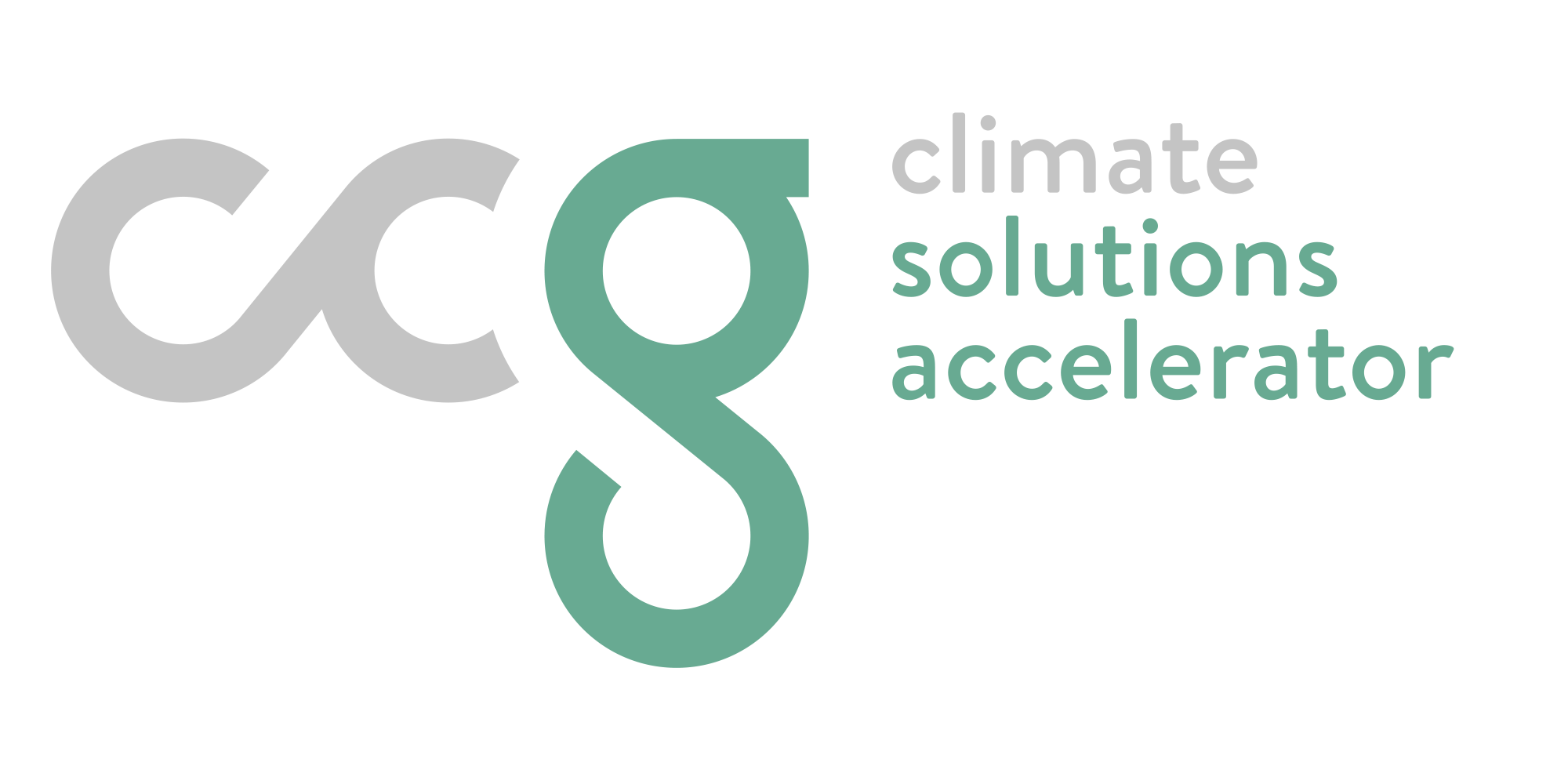
What does this logo mean?
We worked very closely for over three months with Attitude Marketing to guide us through the steps of an image change. This task turned out to be much more difficult than we had imagined. The final choice of the logo had to respect criteria that were dear to us. Above all, our goal was to obtain a simple, clear and pleasant image, while projecting respect, reliability and authenticity. In order to represent the infinite number of possible solutions towards the realization of a low carbon transition, the “c” and the ” g ” have as visual reference the infinite symbol “∞”. It can also be seen as a chain, a gear that represents the link with our customers and the strength of our solutions.
It also indicates the life cycle of the elements that can be recovered and used to meet carbon footprint reduction targets.
Nature’s colors
The marriage between green and grey is an exact reflection of our values: our commitment, our respect, our ability to meet challenges and our consistency. The strength of these colors brings a pure balance, important in a world increasingly challenged by a changing climate.
Finally, these colors are a true reflection of our company: a firm that brings all genres together on the same level.
A signature worthy of the climate challenge
The signatures in French, “Accélérateur de solutions climatiques” and in English, “Climate Solutions Accelerator”, are both based on the urgency associated with the climate. The idea proposed here is to go beyond small steps; rather, it suggests a positive impact approach to accelerate the changes needed to foster a rapid transition to a low-carbon economy.
Of course, appealing to all is not always easy. But we hope you will like our new image and that it will convey the expertise, trust and commitment that characterize us.